Data Visualization
For the software project, I choose to do data visualization. I am a huge nba fan and I keep track
of stats about players and teams regularly. For this project, I decide to create a graphic that depicts
my favorite team, the Los Angeles Lakers' regular season records for the past 15 years. I create a grid and
each square on the grid represents a regular season game (playoff not included).
There are three scenarios. If the team won by less than 10 points, the grid will be assigned color gray. If the team won by
more than 10 points, it will be assigned color yellow. If the team lost, the grid will be assigned color purple.
And the result is shown below.
The inspiration of this graphic came from Light-emitting diode. There are 1178 games played up prior to 1/30/2014.
So I imagine there are 1178 LED on the board. Each LED light(the color) can be viewed
as a checking point. These color on the grid combined indicates how
well the team is doing in general for the past 15 years.
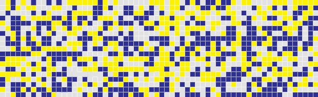
light gray: won < 10, yellow: won >= 10, purple: lost